Tuesday, May 4, 2010

Final Model Project 2


The image above shows the left hand section of the model, it displays how light can penetrate through the mansonry walls with holes in them. It also shows the difference between light and dark spaces and how the aim of the model is to gradually show discovery of the ocean from bottom floor to the top floor. The trees give us a sense of surrounding and that there is a connection between the environment and the architecture itself.


This image again shows the progession of light throughout the model and how strategic cutouts can enhance other parts of the model with light. Light shins also onto the stairs providing the client with an uplifting feeling of hapiness and escape.


Basically, this is my model split into two pieces, I chose this section because I wanted to focus on the way light worked its way into even the darkest places giving us the feeling of seclusion and seperation from the outside world however still keep a gradually uplifting connection with the ocean and escape.


Strategic windows similar to Le corbusiers in the villa savoye can help in providing a connection with the environment. These windows also provide light and help in directing the client through the architecture.


This wall with holes runs parrallel to the ocean so that when the sun rises light runs perpendicular to this wall and hence this effect is shown throughout the model and provides life for the client and glimpses of the ocean outside.


You can almost imagine yourself being in this place and looking through the neat cutouts in the wall and look out to the ocean around you and want to see more and hence the stairs are the connection between the views and essentially the floors.


This is the right handside section model, gradually working your way to the room that gives full visibility of the ocean, it is a very beautiful room, uplifting due to the extensive lighting and can provide clients with that early morning sun as well as sunset view that we all love. We can see in this shot exactly where dark an light spaces are located.


This is a connected whole model of the two rooms, my aim was to keep it as non livable as possible for it is just a meeting place for two people, not a house, essentially a place to getaway to a secluded destination where noone can interupt the two people from meeting up. Some may say this is pavillion like or attract similar characteristics to a villa.


This shot invites us to see the construction between the walls and the site itself, as well as showing tress to indicate a sign of vegetation and environment.

Final Poche Renderings


This axo displays the division between the two levels as well as distinctly separating the difference between walls and slabs and plane areas. Architectonics were evidently used to separate more important walls and floors in the model.


I think the site plan is good in showing how the design sits within the site itself and its connection with the surround area. The heavily shaded area represents vegetation which again reinforces the idea of seclusion and escape.


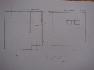
This lower floor plan shows the 1st meeting place that is secluded with only limited ammount of light reaching it. It is a place to relax and meet up with again only small views of the ocean, which wants you to see more of the ocean.


Upper floor plan shows the second and more important meeting place, as this place has a distinct connection with the ocean and the light coming through. It is sealed of from the rest of the world however its only connection is with the ocean side. I wanted to stress that this room is more uplifting and feel good meeting room for the clients.


This is a section that has been taken just to the right of the entrance, which again displays the idea of meeting place and the connection between levels is also evident.


In this picture we can see the wall with the cutouts and how when walking to the higher level the cutouts can also be seen whilst moving to the next level. Finally the top level displaced the secluded meeting place away from everything else, with the only other view being the ocean. This exaggerated the idea of escape with the only place to escape being the ocean side.

Construction Photos


Construction of each section at a time, helps in focusing of elements such as floors, walls, windows etc.


Close up picture


LHS section with no light apparent.


Simple wall & floor combination.


Wall with holes creation.

Change in Concept


I use drawings like this to concept 'muck around' with an idea and try to make it more related to the purpose and in this case the narrative.


This was a concept, feedback was negative on this :( and therefore concept changed again.


This is probably the concept that related the most to my final design.


Lower groud concept.


Upper floor concept.

Change in Site - LORD HOWE ISLAND (SECLUDED DESTINATION)


Zoomed in section that I am focusing on. We can see that the vegation around the beach provides excellent seclusion and protection from the rest of the world and essentially it is a place to get away from modern life.

North is directly up the page.


North part of the island.


Lord Howe Island.

To make the site a more secluded place for the lady to meetup with her lover, I have chosen LORD HOWE ISLAND which is beautiful destination for holiday goers on a romantic trip leaving their frantic modern city lives behind them.

On the beachside the sunrise and sunset are the main times of the day that will capture the concept behind the model.

Views also play an important role in the design of the rooms.

Change in Narrative (After 2nd last tutorial)

'A secluded destination for a fashionably young lady to meet up with the person she desires to be with and overcome her entrapment of modern life'.

EXPLANATION:

Basically, the women facing outwards in the painting desires to leave the restaurant and coincidently wanting to meet up with another person that can make her happy. Therefore in order to leave this place and meetup with another person, the place must be selcuded and in a beautiful place where she doesn't have to feel entraped by modern life.

First Design Drawings

These were the drawings for the first concept which as located at little manly cove, however, feedback tells me that this place is not secluded enough and the design also needs to be changed, at this point I have changed the entire site, narrative and made changes to the concept at hand.


First Attempt Concepts